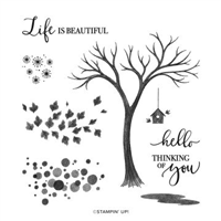
Welcome to the Crafty Bloggers hop. I am fortunate to be part of this group of amazing demonstrators from all around the world. Each month we will be showcasing some of the wonderful products which can found in our suite of catalogues. I’m so excited to share with you an exciting set of projects using a stunning stamp set from the new August to December Mini Catalogue – Life is Beautiful.

Anyone that knows me, knows that I absolutely adore colour. Yes, I know , I’m a crafter and that lends itself to loving colour. But I love bright, vibrant in your face colour! So when we were given the theme for this blog I was instantly drawn to Wassily Kandinsky (1866-1944), a Russian Painter and art theorist, who is one of the pioneers of abstract art.
He believed that true artists could express their inner feelings through lines, shapes and colour. He felt all colours and forms had meaning and carefully planned each painting to express the feelings he wanted to communicate. Squares equalled calm and triangles aggressive. Enclosing curvy lines inside hard straight squares and setting colours that pop beside those that ebb created dynamic tension and made the paintings resonate.
Colour is a power which directly influences the soul.
Kandinsky W.
So I was heavily influenced by his paintings for my colour palette.
The Life is Beautiful Stamp Set is such a stunning set and such great value for the number of stamps included. I can see so many options to for my all year round making. Its a distinctive set so each stamp has loads of detail and texture, making it a great set for beginners and ‘seasoned’ (sorry couldn’t resist!) alike. As the name suggests its based around the beauty of nature and its main bare tree stamp can be decorated using the accompanying images to work all year round. And the sentiments with the mixed font are so pretty and right on trend.
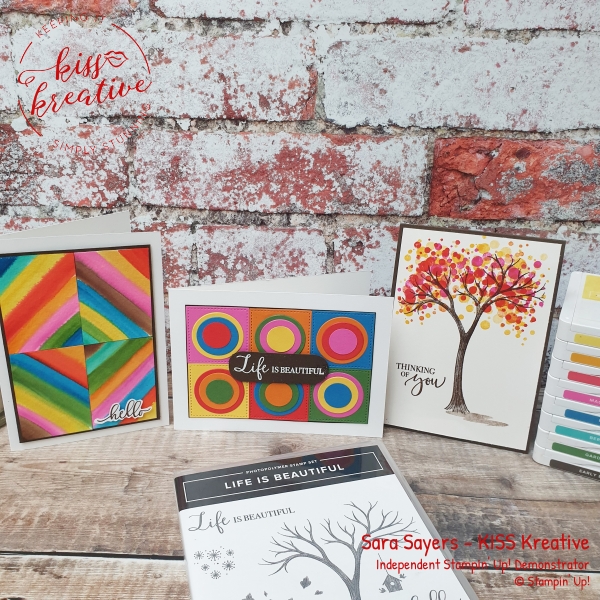
Kandinsky inspired Life is Beautiful simple card
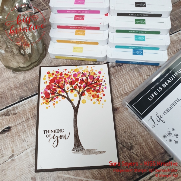
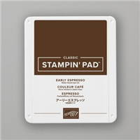
So, for my card, I decided to recreate Kandinsky’s famous Tree of circles painting. I stamped the tree in Early Espresso and then added the shadow in the same colour but this time ‘stamped off’ the ink first to create paler effect.
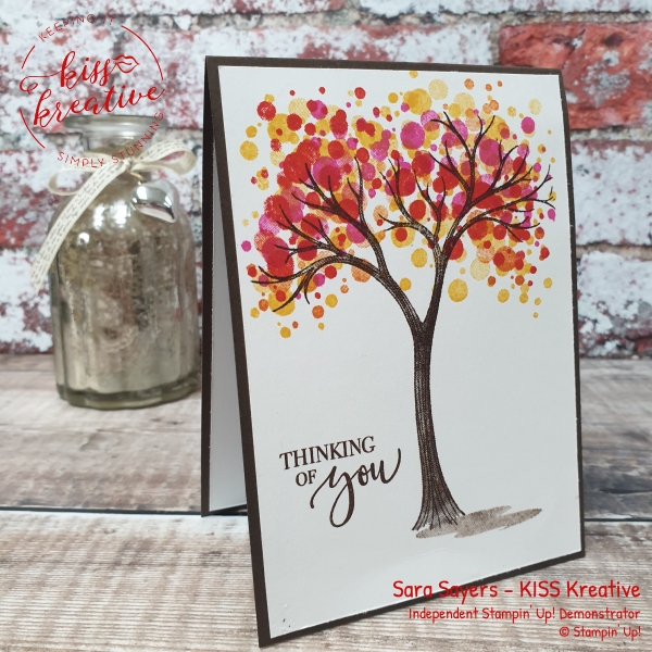
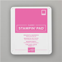
Following the influence of Kandinsky I added circles using one of the images stamping in Poppy Parade, Magenta Madness, Pumpkin Pie and Daffodil Delight. Finally I stamped the sentiment in Early Espresso and mounted onto a card base of the same colour. Simple, but stunning don’t you think?
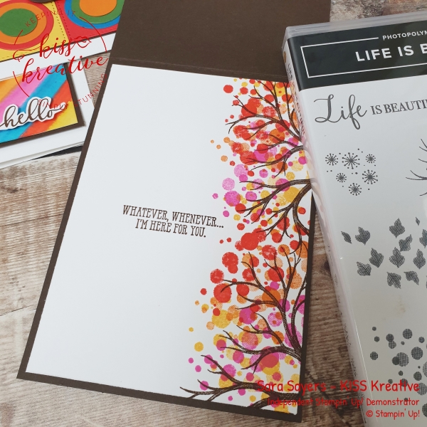
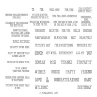
For the inside I followed the same method, but this time stamped the images down the side of the card to give me room to add this very appropriate sentiment from the Well Said Stamp Set
Measurements
- Base: Early Espresso – 29.7 cm by 10.5 cm scored at 14.9 cm
- Matt: Shimmery White card – 14.3 cm by 10.0 cm
- Inside: Shimmery White card – 14.3 cm by 10.0 cm
Kandinsky inspired Life is Beautiful Simple Water Colour Card
Kandinsky made a series of beautiful paintings called ‘Colour Studies’ back in 1913, that have influenced generations of artists. For my next card I was inspired by one known as Colour Studies with Technical explanations (1913). In his books, he described his own perspective on how colours interacted with each other and with the spectator in detail and very poetically. I just love his description of each colour as if it has a musical sound associated with it. Fasinating!
What does Kandinsky say about colour?
Yellow, if steadily gazed at in any geometrical form, has a disturbing influence, and reveals in the colour an insistent, aggressive character. The intensification of the yellow increases the painful shrillness of its note.
Orange is like a man, convinced of his own powers. Its note is that of the angelus, or of an old violin.
Light warm red has a certain similarity to medium yellow, alike in texture and appeal, and gives a feeling of strength, vigour, determination, triumph. In music, it is a sound of trumpets, strong, harsh, and ringing.
The vermilion now rings like a great trumpet, or thunders like a drum.
Blue is the typical heavenly colour. The ultimate feeling it creates is one of rest. When it sinks almost to black, it echoes a grief that is hardly human. When it rises towards white, a movement little suited to it, its appeal to men grows weaker and more distant. In music a light blue is like a flute, a darker blue a cello; a still darker a thunderous double bass; and the darkest blue of all-an organ.
The green keeps its characteristic equanimity and restfulness, the former increasing with the inclination to lightness, the latter with the inclination to depth.
But there remains brown, unemotional, disinclined for movement. An inter mixture of red is outwardly barely audible, but there rings out a powerful inner harmony. Skilful blending can produce an inner appeal of extraordinary, indescribable beauty.
Concerning the Spiritual in Art – Wassily Kandinsky, 1910
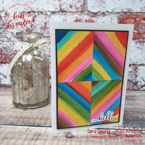
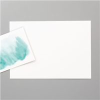
I took four pieces of watercolour card and added layers of colour so when the pieces were dry I could assemble them on my card to create a wonderful diamond pattern. to finish I just stamped and fussy cut the sentiment and added it to the front with dimensionals. So simple, I just love it!
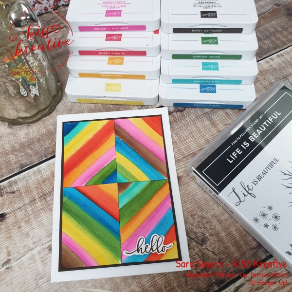
For the inside I added a simple strip of paper left over from another project earlier this week and another simple sentiment from the Well Said stamp Set
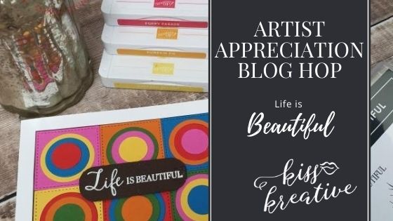
Kandinsky inspired Life is Beautiful Simple Die Cut Card
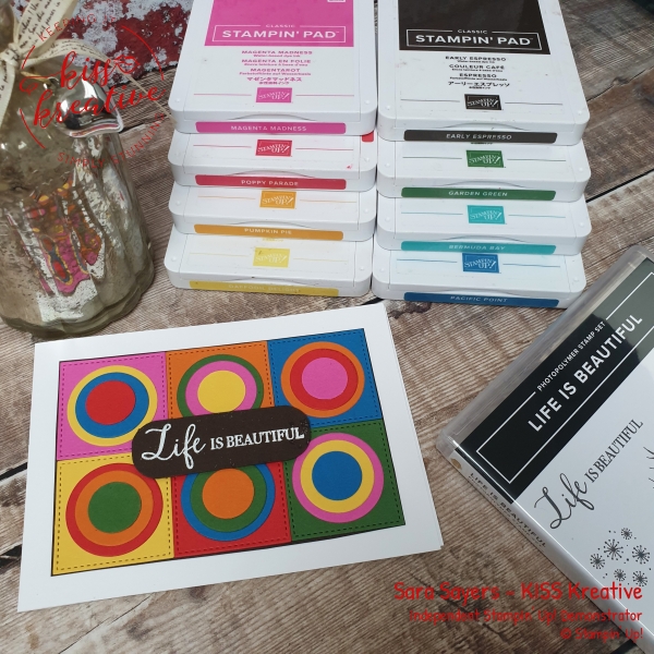
Squares with Concentric Circles (Farbstudie – Quadrate und konzentrische Ringe), perhaps, Kandinsky’s most recognisable work, is not actually a full-fledged picture. It’s actually a small study on how different colour combinations are perceived that the painter used in his creative process as a support material.
For Kandinsky, colour meant more than just a visual component of a picture. Colour is its soul. Moreover, Kandinsky was a synaesthete, i.e. he could ‘hear colours’ and ‘see sounds.’
So, this is probably right that after a century, it is not one of his compositions – which he himself considered as his main achievements – but this small drawing that has become one of Kandinsky’s most popular works.
I was inspired to use our Stitched shapes and Layering circle dies to make this card and it couldn’t be simpler.
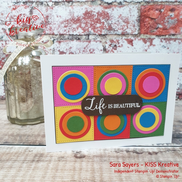
Voila!
I had great fun making this card and I would love to know what you think? Please do leave me a comment.
If you would like to know more about any of this project please do get in contact and I would be happy to help you
So please hop around the rest of the wonderful demonstrators blogs to see some more inspiration for using these wonderful patterned papers
See the rest of the International team below!
Artist Appreciation Blog Hop Team
Shop with me

Thanks for looking
Stamping Hugs
Sara







Wow! Such awesome projects! The tree is my favorite, I love the inside of the card as much as the outside! Well done!
Thanks Nina
Kandinsky’s inspiration with the use of vibrant colors shows through in your creations. LOVE them!
Thanks Tess. They sure were fun cards to make.
Absolutely Brilliant! I love Kandinsky!!
Thanks Dana
Wow! All your projects are amazing and so vibrant. Love the use of colour
Thanks Helen
Beautiful cards. I love the effect of the layring stamping on the tree card, gorgeous!
Thanks Stacey
That was a great blog post, really interesting and informative, thanks Sara.
Thanks Helen
Wow! Your cards are stunning and love all the info you provided on the artist that inspired you. Amazing!
Thanks Pauline. I had so much fun on this project